(585) 861-7483
Eye-Tracking: How Visitors View Your Web Pages
One of the coolest pieces of technology available to a marketer is the ability to see how people actually scan a web page. Let’s take a quick tour of this research.
It’s an industry fact. Attention of a website visitor must be had within 2 to 3 seconds of viewing your web page. I put together a few examples of just how this actually looks in the eyes of your visitor. Click on this link to do a Google Images Search for eye tracking, scan the page yourself and just see what people actually look at.

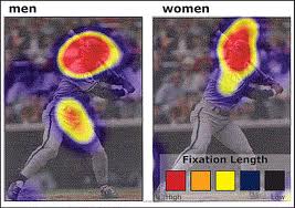
The picture that cracks me up the most is the picture side-by-side comparison of this baseball player swinging a bat. The picture on the left shows what men look at and on the right what women look at. I guess size does matter… but to who?!
If you’re wondering how to create your landing page, here’s a great video by Tim Ash on this very subject. He takes you on a tour of website examples, both good and bad… well mostly bad, but anyway you’ll likely find it extremely interesting and yet familiar.
[youtube]http://www.youtube.com/watch?v=erdEZvOq6wo[/youtube]Ok, what about my website? Well, my only thought was to make it as little distracting as possible. Lack of color where it’s not needed, plain text, calls to action where I want them. However, there are lessons to be learned of what not to do as well. When I have the “free time” to actually work on my own design as opposed to managing 200+ client websites, well then just maybe.

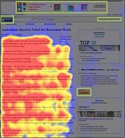
What about all of those banner ads you see? Here’ another example of just how powerful actual text content is in comparison to flashy banner ads and their position on a webs page. Notice the ads in green outlines. My thought on this is straight-forward: there is so much out there to distract us that it becomes “background noise” to our eyes and we gradually learn to ignore it. If not, we’d be overwhelmed by the sheer stimulation of stuff around us. Got to mix it up. I think the best place for ads is directly within the content itself.
Hopefully this little lesson can help you with your landing page goals too.

Wow, that’s truly amazing! I wish it was cheaper to analyze. I would love to do it for a few of my own websites, but all of the options I’ve looked into have been so expensive. And what we have is converting pretty well, so I’m not sure I can justify doing it yet!
Ya, Its true….I am doing this for my sites….I love to see this here…Thanks for posting….
Great..!!!I also agree this……Thanks for sharing…
keyword search tool…
[…]Eye-Tracking: How Visitors View Your Web Pages[…]…